THE TERRY GILLIAM FILES // BRAZIL (1985) |
Capturing A "BRAZIL Look"
|  |
|
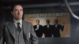
How did you first come to work with Terry Gilliam? Norman Garwood: I was asked to be art director on TIME BANDITS with Milly Burns, who was the production designer. Milly had worked with Terry once before, I think on JABBERWOCKY, and it was a tiny art department so my role was pretty enormous insomuch as there was myself and a draftsman and one big film to sort of organize really. And Milly was very much into the dressing — I think she's a lovely lady, she's excellent. My role was to make sure to see that the sets were designed and built. I did lots of work on the location; Milly would tend to stay with Terry behind the camera, [and] I'd be off doing the next [location]. I got a lot of the time with Terry to spend talking about sets. We would all sit around, just sort of get on, and we would make lots of models, and then just spend most of the time at the drawing board drawing and making these wild ideas work. TIME BANDITS was an absolute joy to do. It was just a lot of fun. I remember when I first read the script I thought, 'This is outrageous, it was so lovely.' And then I got on really well with him, I thought he was amazing guy, incredible visuals, so we kind of struck up a good relationship with that. It was my first adventure into the movie world, which was just a fantastic thing to get involved with. What were your TV credits prior to that? I did a lot of those wonderful ABC-TV things [like] ARMCHAIR THEATRE, PUBLIC EYE. I started in TV in 1967, and was in it for 11 years, every form of one-hour TV drama possible. I won a BAFTRA award for a series of Victorian adventures called THE RIVALS OF SHERLOCK HOLMES. Then I got a call from Milly saying she was looking for an art director; somebody who was a mutual friend recommended me. It was great start — to start off doing that was just wonderful. When did you first hear about BRAZIL? Terry never talked about BRAZIL when I was doing TIME BANDITS. I think it was a project he had obviously in mind, but I went off actually and did a few movies after that before I got to hear of BRAZIL [including THE MISSIONARY and BRIMSTONE & TREACLE], and then I heard he was going to do it and I got sent the script. I was thrilled that I got sent the script; I just thought it was the most outrageous thing I'd read. I knew to get the opportunity to design it was going to be just fantastic. And it was, there was no question about that. Then when I got asked to do it, I spent a lot of time with him and Jim Acheson, the costume designer. We just spent a lot of time at his offices in Covent Garden, just the three of us just throwing a lot of ideas together, as crazy as possible really. We would just put as much stuff down visually as we could and that's how I think I spent the first month or so, really just with Terry and Jim, Jim joined us late, in the offices just banging lots of different ideas around about how this thing should take shape and form. Because it really took a life of its own once it got going. I mean, when I first took on the prop master, I think everybody thought it was going to be a travelogue, just 'What's this BRAZIL all about?' They thought it was going to be a film about the southern part of the world. Once everybody got involved with it and knew the spirit of what BRAZIL was about, it was amazing because everybody would come up with great ridiculous ideas. 'What do you think about this? It's a bit BRAZIL, isn't it?' Everything's got a kind of 'BRAZIL look' to it, you know, and that was the enthusiasm which kind of grew out of the actual film itself, really. At what point did you recognize what did or did not have a 'BRAZIL spirit'?
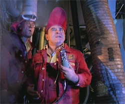
It was a very big cooperative effort because we had a great effects department, they would just all go down and start assembling things like the typewriters. That was basically just a lot of effort, we put a lot of stuff together, then we would get Terry involved and he would [go], 'What if we move that and we add that,' then we suddenly realized it was a look forming. First of all, Terry found this thing with the ducting, just sort of ducting going through a room or whatever, and then the ducting then grew and grew because we thought, 'What if there was ducting not just in the poor areas? What if we put it everywhere?' Like Central Services just in the end put the ducting everywhere and if it was in a smart restaurant then it would be 'poshed up' ducting with mirror balls, sort of squares on it. So it just really grew and grew. 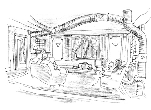 As I say, the feeling and the spirit got more outrageous, insomuch as I remember very clear one day when Jim Acheson brought the drawing of the shoe hat into my office, and he said, 'It is too silly, isn't it?' I said, 'Jim, it's just outrageous, it's wonderful.' And I mean, we were all encouraging each other to be stupi — not stupid, but as outrageous as we could with all our thoughts, really. And we found it did take a life of its own, I felt, that with shape and form and then with color really as well. I mean it was amazing how it did develop.
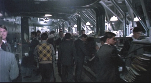
I really think were never limited insomuch as we were just tapping into people's imaginations, and saying, 'What will the film take?' I suppose [Terry] did have parameters, yes. Everything fit into a path, once we'd established what the world was and what Central Services was — and really there wasn't much terrorism around, it was really Central Services' bad, bad workmanship kept blowing up. I mean everyone thought there was terrorists, but really there weren't, just things that never worked properly. How were those ideas of a 'BRAZIL look' applied to particular characters? I think it was in many a combination [of] colors and textures. I think certainly where Sam would work, we wanted that to be very monochromatic, very gray, very somber, and that reflected in costume and in all the set ideas — it would be grays, blacks, white actually. It was really just saying that this [environment] was drained of any color of life really. Tuttle's house was very devoid of any kind of color, and then the characters like Sam's mom, that's where the beautiful bursts of colors would come insomuch as that was the difference between her life and the other poor people who were in this very colorless bureaucracy. Her life was full of color, and I tried to emphasize that with her apartment. It was quite outrageous as far as Egyptian feeling and bright colors. The bedroom where [Sam and Jill] finally make out together was just again very beautiful and colorful, but Sam's apartment was again a gray world which was attached to the world in which he worked. The clerks' pool where Sam would work before he got promoted, again I didn't want to have any color [to portray] the mundaneness of it all. Everyone would just go to do their work, and the only bit of pleasure would be to try to tune in on their TV monitors an old film or something — that was the little bit of sparkle in their very gray lives.
[Laughs] Not too much sparkle! We thought about that right at the beginning, it would be a gray world, but certain things did evolve, like Sam's mom, that was one area where we could just really splash some color. There was also the shopping mall at the end; that was an attempt again to have a lot of fluorescence, colors. But that was about one of the only spots where it worked. What sets were built vs. those that were found locations? Mother's room, that was a location. Mother's bathroom was a build. The Ministry offices, that was a big build, at Lee International. Terry and I actually went to locations [looking] for that but everywhere we looked we couldn't find it. We were basically looking in France because the apartment building where Sam lives, the exteriors for that, were shot in Marne la Vallée, that sort of post-modernistic block.
That one wonderful location, the torture room, that was the interior of a cooling tower at Croyden, It was an old power station. That was amazing because Terry and I were looking at the basement areas, we were originally trying to get into Battersley power station and we couldn't get permission to get in there at all, so we tried another power station just outside London at Croyden. We found some amazing basement areas of machinery and pipework and tubes and whatever for the chase at the end, then we were just looking around the perimeters of the closed-down power station and there was a huge cooling tower (they were all abandoned and had been left for some years). Basically all it was was this huge tower where the water would be shot up in the air at amazing hot temperatures and then it would filter down and cool off and recycle again. We walked into this cooling tower and it was just a wonderful location. I was going to build a torture room and we had very much a different image for that in mind: it was going to be white and clinical. And we walked in and Terry and I both said, 'Well, it's gotta be the torture room.' That was how that arrived. That one was really just an amazing find we had. 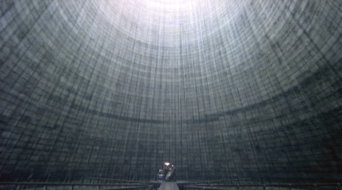 How was that lit? The torture room? That was amazing for Roger Pratt (the cinematographer). Enormous crane, one long crane arm. with almost like football lights at the end of it. The thing about Roger Pratt is he's a great guy and an excellent cameraman. We spent a lot of time together which I think is great if you can do it on a movie because he was around sometimes, especially with things like the padded cell which Sam ends up in, he was around when I was designing that, and said, 'Wouldn't it be a great idea if we lit it from the top and the bottom?' And we planned a lot of things [like that]. Roger was involved in the early days of some of the sets which sometimes doesn't happen with cameramen; they come on quite late to the movie. It's almost like a fait accompli for them with locations and sets. So that was great insomuch as it was a long film and a lot of the sets were still being drawn and designed as we were going through, having his input as well as Terry's. 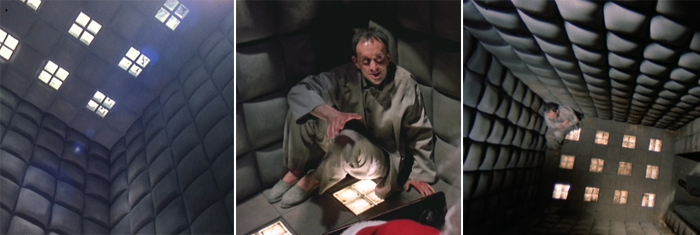 Where was Mother's apartment shot? The Liberal Club. That's gone now, which is sad, sold off to a hotel or something. And the restaurant? Mentmore. That was an interesting location insomuch as when we got there it was basically a huge hall with a gallery going around all four sides, and we looked at it and Terry said, 'Well, all the interest is high up,' And then I said, 'Well, why don't I build a floor to lift everybody up so that people come in and go up steps to this high-level restaurant area.' And then we had the central columns of ducting in there as well. That was a great location and the people there were, I think it was a sort of a transcendental organization. They were not reluctant but they were slightly concerned that we wanted to come and build this restaurant in the middle of their hallway and then blow it up. But when we finished the set they were so taken with it, they sort of inquired whether it could be left, because they really liked the whole idea of this restaurant! But we couldn't. The ducting as well? They absolutely loved it. They were an interesting bunch of guys, they were great. There was reluctance there and they really warmed to us as we were building it, and then when they saw it complete they thought it was so wonderful, yeah they said, 'Is there any chance of leaving it?' Ah, dear... 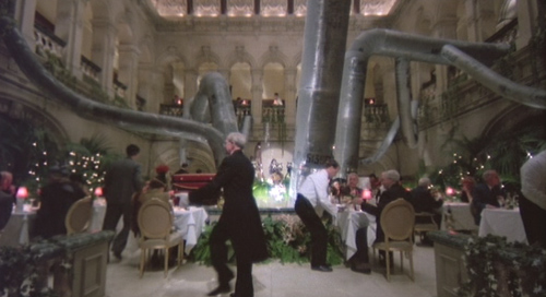 The clerks' pool was shot in a former flour mill? It was an old flour mill which was in the east end of London, and now that's all disappeared there. I mean, everything is gone. We used that for the exterior of the Tuttle flat, when [Sam] arrives in his little bubble car, and then downstairs there was a huge area I was trying to find an enormous, long — I mean, I couldn't find a space big enough to put when he first gets promoted and then goes up and gets out of the elevator and looks all in all directions and we just see these gray corridors. For me to find a stage to put that on was going to be an enormous stage, and we couldn't find one big enough. That room downstairs was where the flour originally fell through and was loaded up into these trucks I suppose, but it had been abandoned for years and the place was just rancid; it stunk and was full of water and rats, I went into it and looked and could see these wonderful columns going on forever, concrete columns, and these great holes in the roof or in the ceiling. I just got some lighting and lit it up and it was just meant to be, there was no question. I just thought, 'Well, if I could fit in between these great concrete columns, with office doors and whatever, I could make this set so enormously long.' And I took Terry down there and showed him that and he loved the idea, so that was that one. And we were trying to do the clerks' pool at the Croyden power station and we found one location there and then we couldn't use it because the area was still radioactive, and they closed it down. We'd been in there to look at it and they said, 'No, the levels are still too high for you to be in there for too long and work.' So when I was at the flour mill I just found this room where the flour is shaken around in these big wooden machines, and then what was amazing it almost was like shouting out I want to be in the film! because there was duct work going to these machines, and I thought, 'It's part there already.' And I took Terry to see it and he said, 'Well, it's up to you if you think that can work,' and I said, 'I'm really convinced I can make this.' I just did some quick sketches for him and a rough model, and so we decided to do it there. The combination of building a location for me is wonderful. I like that whole idea because it's so convincing, I think sometimes more convincing than building a set on a stage, when you've got the length. People will never quite believe that it was a set, so that was for me probably one of the most successful of the sets in BRAZIL. I still whenever I watch the film I still feel very pleased and very proud of that because it was when I had finished designing and getting it built and painted, and then Terry shot it incredibly well, I just felt it's one of the best sets I think I've done, and I've done a few, but that still ranks as one of the best. As well as the corridors, I love the new offices, but the actual clerks' pool was such a fantastic atmosphere. The floor was falling through and it was just one of those it's either going to work and be amazing or it's going to be a disaster, and I was convinced it was going to be amazing. So we took the chance and did it and I think it came out great. Did you use forced perspective on the really long corridors? 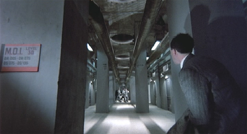 Yeah there was. I built as far as I could go with the corridor and I made it into the shape of a cross basically, had people crossing like two-thirds down, and then right at the end of the long corridor then I got a scenic artist to paint a single-point perspective of the corridor, just disappearing to one pinpoint and then we just hung all these lamps in and then we made some smaller lamps for the back and then we painted the rest of them, backlit them. It was just another great opportunity to try every thing out ... a set which disappears to infinity almost, the longest corridor in the world. It's a very different look from the white tile corridor.
We built that and Jack's office that was off that corridor, and [in] his office I just hinted at the curved wall which then led to the torture chamber (which was down at the power station). So, finding a location — like the cooling tower — can change not only your approach to a specific setting but also other locations as well. Yeah. What about the glass cubes? They were really cool, and popped up a lot throughout the film. The glass blocks. I found that I think in a '30s or '40s magazine, and I just loved the whole idea of these glass blocks, because you could light behind them, again I felt it was very much a BRAZIL feel. We tried them with one set, Sam's office, 'cause that was the first set we built, and they were so beautiful once we got them in, and that was like trying something for the first time, it was a pretty safe thing to try them in the office first of all, and it was one of those things that everyone said, 'They are amazing, let's use them again.' 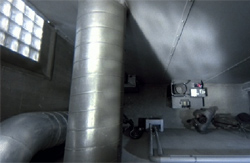 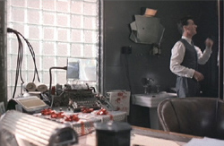 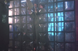 We'd bought them anyway, I think they came from Germany those blocks, and so we had them, then it was like, Where else would they look really cool? So you know, that's how the glass blocks arrived. It was just trying them in one set and then everyone loved them so much it was then a question: 'Why don't we try them for this set, you know?' Where was the exterior where Sam is running around shot?
What about the inspiration for those ominous posters and billboards? Those posters, all of those things were just the most beautiful things — I wish I'd got them now, or a copy of them. They were just things we'd found in books, like the airplane image, the holidays and things. Obviously Terry had all the actual words for every one of them but they were just beautiful images we found. And then we had a series of, like, 'Suspicion Breeds whatever,' we then just started putting all these images with the dialogue, so that there was just again these '30s magazines which were a constant source of inspiration, that's how most of the those things evolved. We just had the visuals and then fit them with the actual words. What was your budget? I never really knew, David, it was a very closely-guarded secret! I could never tell. It was that kind of film, it was pretty limited in what we had. You know, I'm being serious now because this film I'm doing now I know exactly what budget I have in the movie, this is not a big budget movie at all. On BRAZIL, I mean I would come up with a design idea and then it would be rejected as too expensive, and I would go, 'Well, what have I got?' Then I'd do a different version of it and then that was costed, and that was accepted, but really it was a pretty closely guarded pot of money, I must say, on that. No one ever said to me 'You've got a million point five dollars, you know, to spend and you can't have another penny more.' It was really just a question of how you're costing each set individually, and doing it that way, and if it was too expensive then we have to cut back. It really was a little bit hit-or miss-for me, insomuch as I would design something and if they were too expensive then I would go back to the board again to come up with something which wasn't as expensive as the last attempt, but in terms of knowing exactly what it was I never really knew. It wasn't very much, I know that! What were your exact responsibilities as production designer, and how did you delegate jobs to others on your staff? The production designer is responsible for the look of the film, in all aspects really. When you're working with someone like Jim Acheson, Jim's just a wonderful designer, but then the art directors it's their responsibility to give me the space to design and to consult with Terry, and then I come up with the ideas of what we're going to do, locations, how we're going to treat the locations, then what each individual set is going to look like. Then I hand the responsibility over to my art directors and they are then responsible for getting it to look exactly as I visualized it. That's the function of the production designer. I get the chance to sit down and visualize Terry's visualization, that's basically what I do, that was my function on that movie. My art directors then take all of those ideas and then organize the drawings, give them to draftsmen, they will get the draftsmen to draw my thoughts and ideas and I will go back and they will ask what do I think about that design, that color, and eventually we get everything onto paper, and they will go down to construction and again I will keep my eye on everything that is being constructed to see it's the right proportion, the texture that I want. So that's the process. BRAZIL has clearly had an influence on the look of many other films since then. I've seen it crop up in a lot of places, in commercials, it's flattering! It's the film everyone remembers and knows me by. A BRAZIL only crops up once in a lifetime, as a film to design. I'm just very pleased that I was the guy who was given the script and asked to do it, because it was a chance to create a world that as you say now people still pay homage to BRAZIL. It's great, people do slip into it. I see it everywhere. There are a lot of commercials I suddenly see a look and you think, 'Hello, I've seen that one before.' When I finished that movie, there were other offers of films; people would ring you up and say, 'Well, we want this kind of BRAZIL look.' Everybody knows what it is, it certainly has a certain style. Apparently once you've done it once, I don't think you can top that as a film to do. Also to me, BRAZIL was a film that every other designer in the film would have loved to have done. It's like the designer's design film, really, I'm just pleased it was me that did it. It's been imitated quite a few times, and I found I wanted to shy away from doing anything like that again, because it was the time, it was when we did it, it was the people, it was just everything came together at that time, and I think if you attempted to do it now it would probably be a lot different. It was just the mood of the time, and Terry's influence and all of us young whippersnapper designers and costume designers. We were so eager. It was just so right for us all when that came out, there was so much energy, I cannot tell you, which went into that movie from every department. The result is what you see and that's what makes it such a visual tour de force. It really was a huge effort. It's one of those films that won't date because it never had a date. That's the beauty of it. It has a look which will last forever.
Postscript: Garwood's subsequent film credits include HOOK and GLORY (for which, like BRAZIL, he earned Academy Award nominations), as well as THE PRINCESS BRIDE, MISERY, CUTTHROAT ISLAND, LOST IN SPACE, ELLE ENCHANTED, the remake of ROLLERBALL, and THE LIFE AND DEATH OF PETER SELLERS.
|
copyright 1996-2009 by David Morgan
All rights reserved.


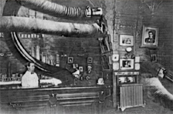 The look of BRAZIL, it really did evolve. I mean, I started to look at a lot of '30s and '40s, more '30s magazines. There was a sort of Deco feel which we wanted, and then it was these inventions that you would find in the '30s books, it was almost like 'the shape of the world to come,' what people thought armored vehicles would look like in the 21st century, and what airplanes would look like. That was a great source of inspiration, early magazines. And then it was just taking that and building upon that. But things like machinery and equipment, that kind of just evolved really.
 Was there anything that was too outrageous?
 And the clerks' TVs are all black and white.
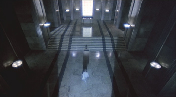 So where he walked, that was locations obviously, and then the balcony and the actual interiors to [Sam's] apartment was a build. The Ministerial building, we gave up with in the end and I said, 'Why don't I build it? It would be easier.' So I came up with that big set with the steps and then we revamped that into the second office when Sam is promoted. All of the corridor stuff was a build.
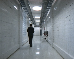 That was a set. There's a funny story attached to that, because when we tiled it what they do is they leave all these little bits of white card just to keep the tiles that eighth-of-an-inch so you put all your tile grouting in. And Terry came and saw this before it was grouted with all these bits of card, 'cause they looked like razor blades ! And he said I love these, and it was really funny because I said, 'Terry, they're just bits of cardboard to keep the tiles the distance apart from each other.' And he said, 'Can we leave it?' It was one of those things where I said, 'Ah, it would look silly, it'll look terrible,' and he says, 'No, no, no, leave it, please leave it.' So we left it, and it did have a great quality — it looked really dangerous, looked like a tile corridor with razor blades sticking out of it.
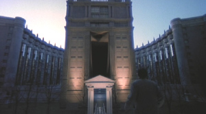 That was in France just outside Paris, at the Marne la Vallée, this big housing project which was designed by this Spanish architect Ricardo Bofill. That was where we found the apartment, all the precinct areas, it also had that amazing crescent where he runs toward the [funeral parlor]. We shot all that on location, and then the interior of the funeral parlor was at a big department store in Knightsbridge, the top floor, which was a disco during the week, a dance hall sort of thing with these gold columns. That ceiling was in fact a huge mass of disco lights which they wouldn't let us touch or take down, so we had to build a great big canvas, really lightweight ceiling to put up in front of the disco lights, to get that white ceiling, and I just had this mad idea about black plastic with air being blown underneath, sort of wafting along this walkway. It was just fans underneath blowing, it rippled and wafted around.
